Download the free printable
Download PDF (1 page) Download PNG preview
US Letter, 8.5 x 11 inches. Print at 100% for craft pieces; use Fit to page if your printer clips the margins. An adult should help with scissors and fitting wearable crafts.
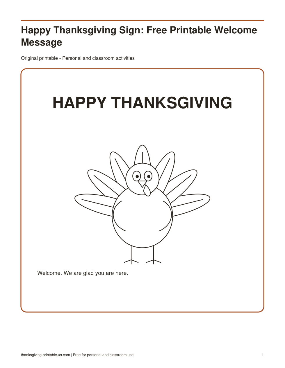
A Happy Thanksgiving sign adds a clear seasonal welcome to an entry table, classroom display, or gathering space. The printable keeps the greeting simple so it is readable from a short distance. Add event details on a separate note rather than squeezing too much information around the main message.
Choose a useful display spot
Place the sign where guests naturally pause, such as a welcome table or the wall behind a buffet label station. Check the view from the direction people approach. A sign hidden behind flowers or serving dishes may look attractive up close but fail to greet anyone.
- Print one copy and check that the main message is clear.
- Trim only if the design allows enough border.
- Mount the sheet on a larger piece of paper or place it in a suitable holder.
- Add a separate handwritten note for names, times, or directions.
- Stand back and confirm that the greeting is easy to read.
Make it part of the gathering
For a family meal, place a small stack of blank thank-you notes beside the sign. For a classroom event, invite students to contribute paper leaves around the outside. For a community gathering, use the sign with clear directional labels so the greeting and practical information each have enough space.
If the sign will be reused, avoid writing the year directly on the main design. Add the date on a removable paper strip instead. Keep the original printable flat when storing it, and replace a curled or stained display copy when needed. The greeting works on its own, without extra seasonal decorations.
Frequently asked questions
Can I add a family or classroom name?
Yes. Write the name on a separate strip or on a backing sheet so it does not compete with the main greeting.
Should I print in color?
Use the version and printer settings available to you. Check one copy for contrast; the words should remain the easiest part of the display to read.